John Wayne Airport
Rethinking the Brand Expression for Residents, Guests and Travelers in Orange County, CA.

Original Logo
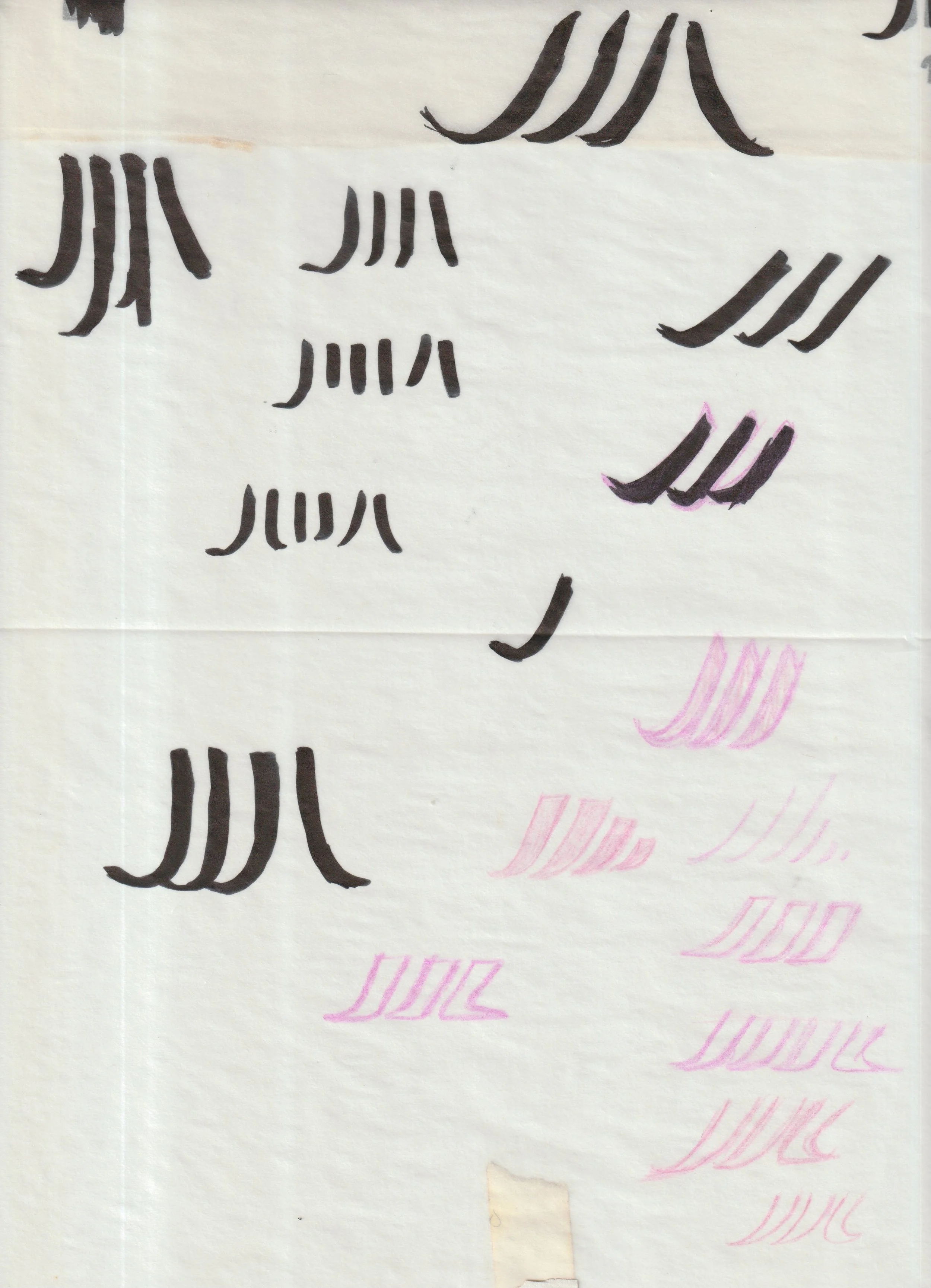
Ideation
Sketches

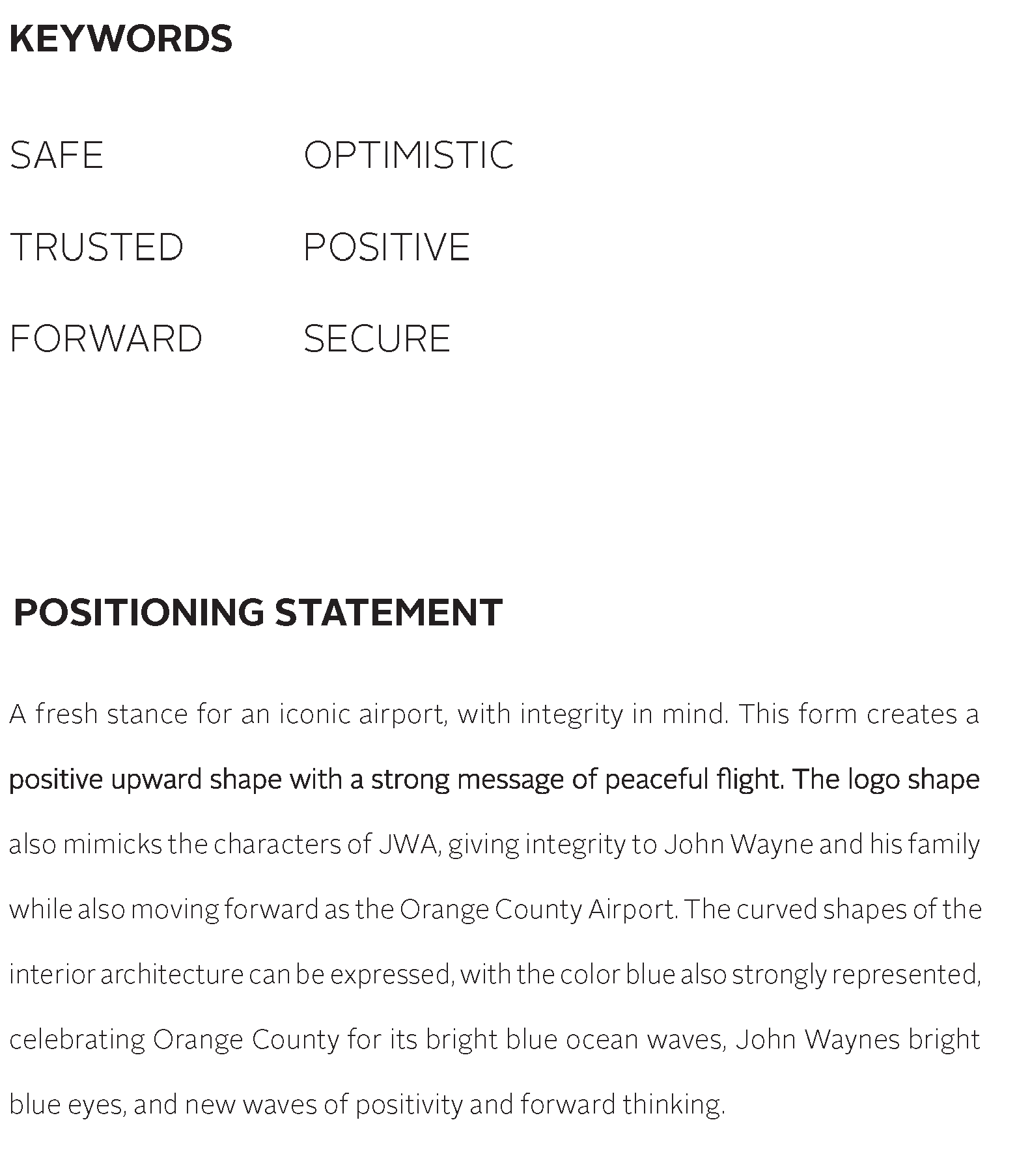
The chosen direction was influenced by upward, “in-flight” motion, as well as incorporating the initials of John Wayne Airport, experimenting with variations of weights and styles of the letters J, W, and A. The symbol is also meant to translate positive change, as the airport accentuates the idea of progression. Use of color later on can also be used to translate the colors of California, or the waves of the ocean.
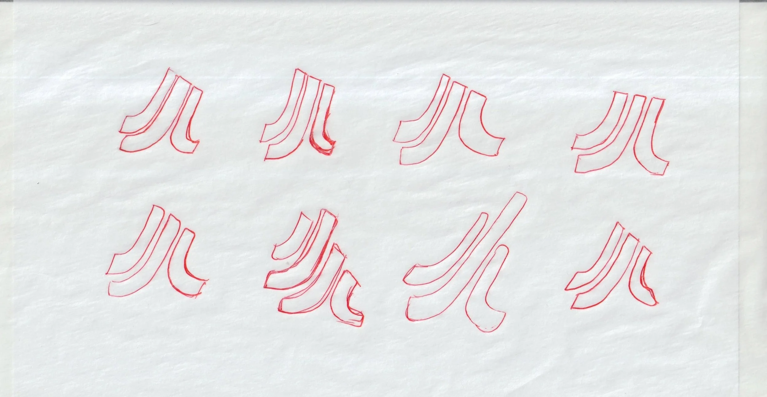
Progression

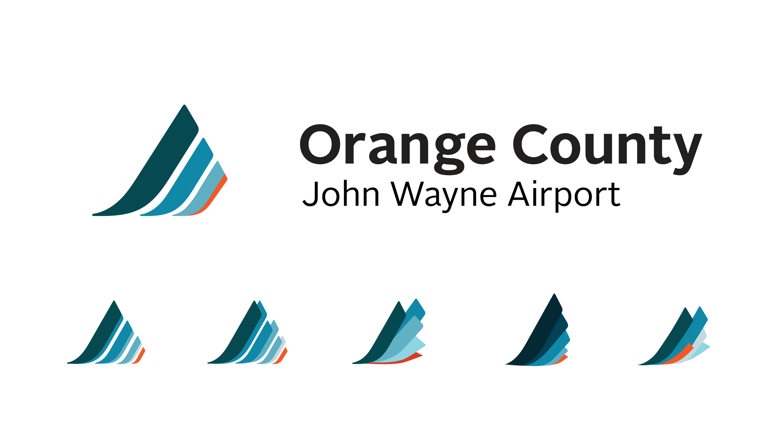
Brand Logo
& Variations
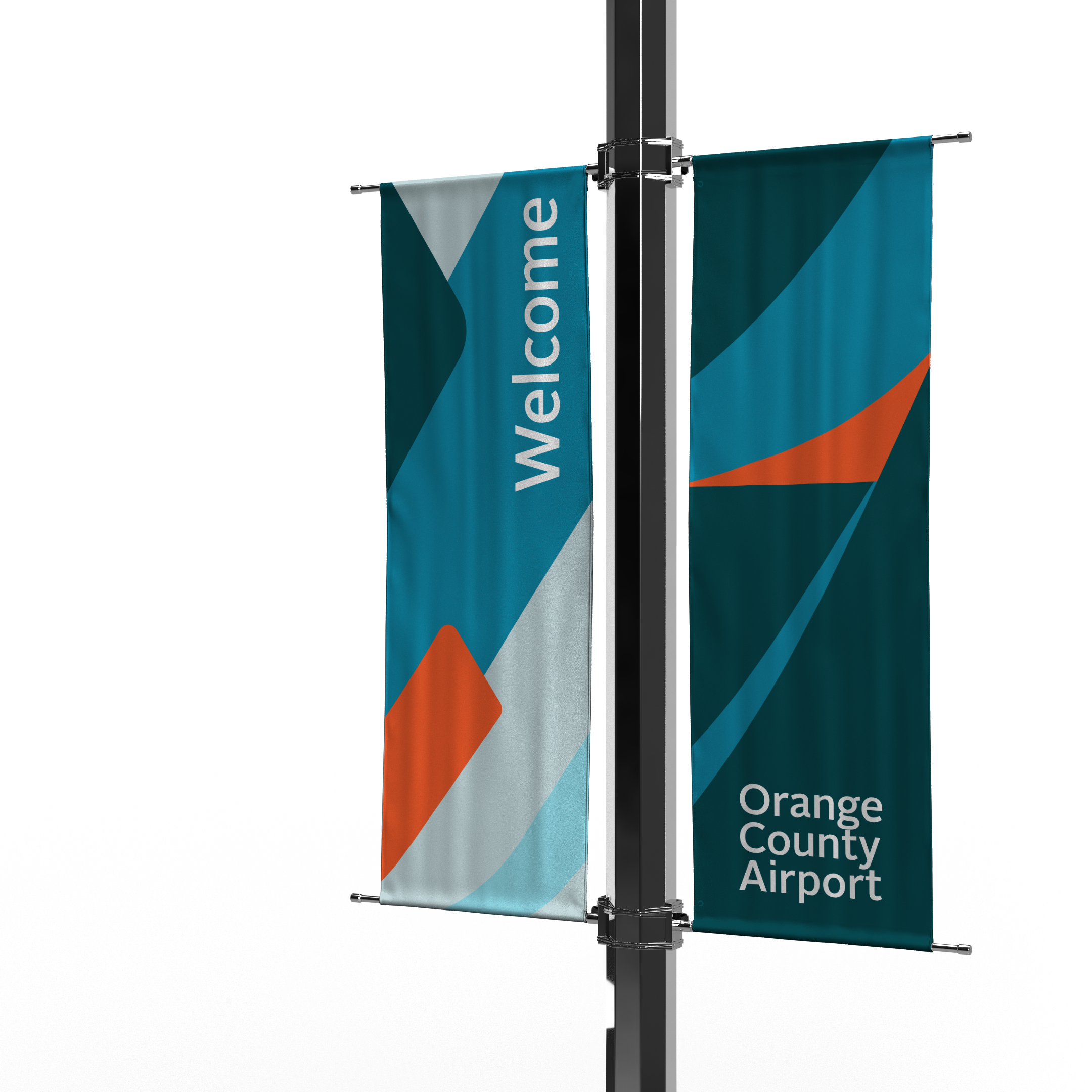
The symbol design reflects the positive and safe traveler experience and connects the former identity of John Wayne Airport, with a fresh look and form. The symbol can be identified as John Wayneʼs initials, as well as the motion of an ocean wave, and upward flight. The updated logo, color story, and type choices are a refined vision of the Orange County Airport, delegating a simple and fine tuned corporate shape, along with three other versions in different ways. This is to eccentuate this idea and incorporate them in different brand placements.
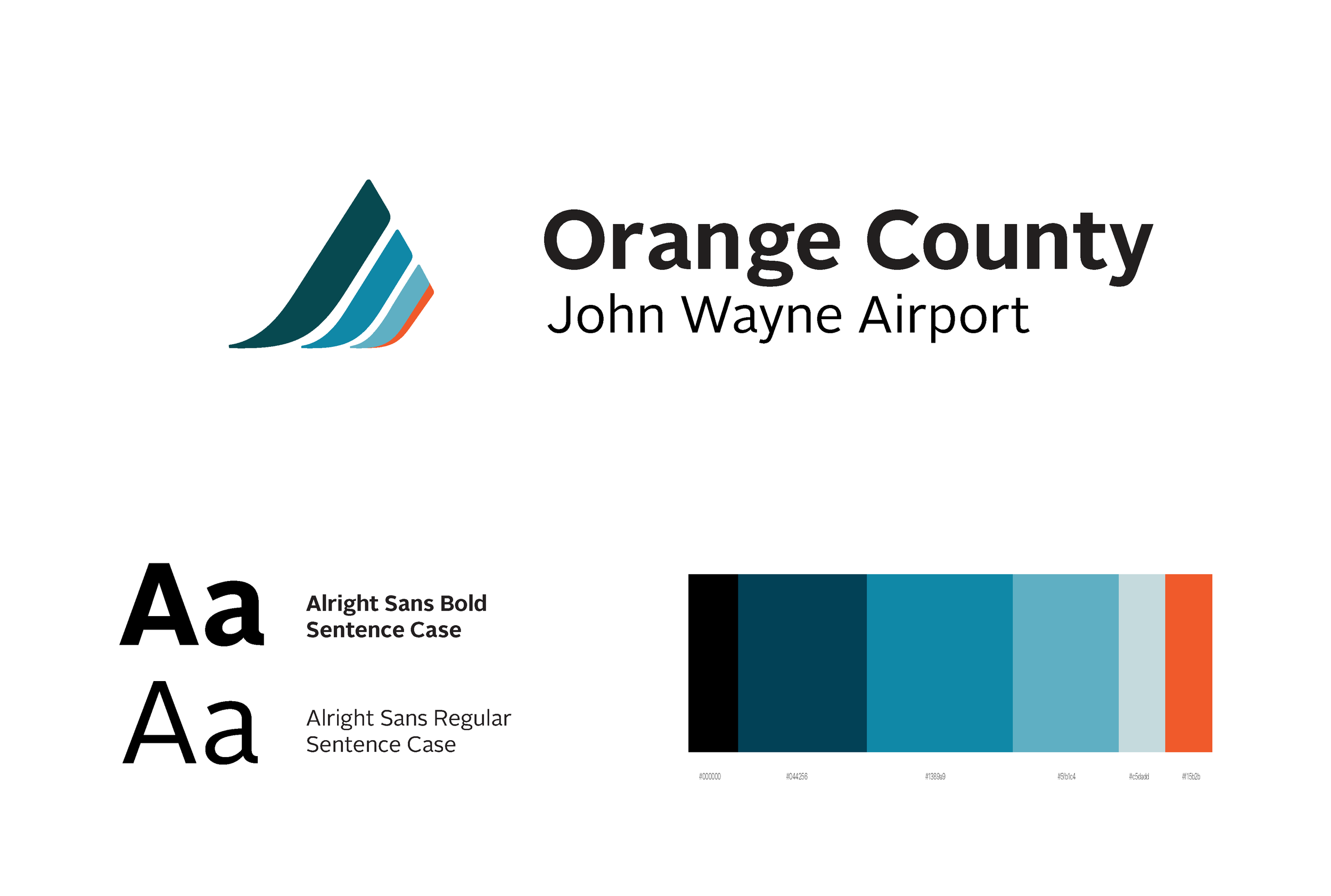
Typography
The wordmark is designed using Alright Sans Typeface in Sentence Case variable. This type has a unique comfortability with natural curves that feel safe and comfortable. Both weights will be applied as compliments to eachother. The wordmark can be used alone or in conjunction with the symbol.
Color Story
A color system that reflects the Orange County identity, with its hues of bright blue skies and serene ocean waves. We also represent these blues as forward positivity, flight, peace, and productivity. A subtle charm of red-orange represents the power of our dynamic and unique expression, along with our complimentary blazing sunsets. The color hierarchy can be applied as shown or within the system as needed.